Tuesday, 21 January 2014
My magazine Double Page Spread (final)
I also got feedback for my double page spread, just like my contents page I had to change the spelling mistakes I made when writing the article. I also had to make the title to the feature stand out more and make it look less pixilated than what it was. I done that by zooming in to the title, then with the paint brush tool I carefully went around the edges with back then filled them in so it would stand out more and look less pixilated. I had changed the eye colour and hair colour around, because before it didn't make any sense. I got rid of the images of the chips and Harry Styles, because they were not my own photos.
My magazine Contents page (final)
After handing my work in, I got feedback to make some changes on my Contents Page. I was told to change the spelling mistakes, to add a signature to the bottom of my editors note and to add more articles into the contents page itself. I had changed the editors note so that it had a signature by signing my signature on a piece of paper, then scanning it into the computer. I had also changed the contents page so that it didn't look like it was too full. I added more articles to the bottom of the list, because my contents page was looking too empty at first. I had also changed the position of the editors note and the picture that goes with it so there would be room around the whole thing and it would be easier to read this way also. With the editors note I decided to change the font, because before it was all the same font and the whole page looked the same, I then decided to vary my fonts for my finished product. I also changed the page number, because my page 2 would have been an advert.
Front Cover (final)
This is my final Front Cover for my magazine, I had to change a couple of things when it came to doing my final product. I changed the 'Exclusive Interview' part, because the name of my artist was hidden behind the image I had of her. I thought this would be a problem, becasue it wouldn't have stood out enough if it was on a shelf. I also got rid of the line that was under The Vamps, because it didn't fit in with my overall design.
Friday, 10 January 2014
Thursday, 9 January 2014
My magazine Double Page Spread
I have split my double page spread in two. I have done this by placing an image of my model as one half and the interview of the artist as the other. On the interview half I have used boxes to split certain sections of the interview. I have overlapped the title of the feature with the picture, because I didn't want a definite split between the picture and the interview, I still wanted it to look like the same feature. To get the font I wanted I had to search on different font generating websites, I finally found the font I wanted on the website www.fontspace.com. My inspiration for the font was the Alice in Wonderland inspired font called 'AliciaWonderland'. I had made sure that when it was expanded to the size I would like, the resolution would be able to uphold. Behind the title I have placed a pale pink box, so the title could be seen clearer, because of the contrast between the two colours. I have done the same thing with the introduction to the interview, again so the black writing could be seen clearer. For the interview section I have used the same light pink, but I have used it in an 'L' shape so it's easier to create the columns I would need for the questions. In the empty space, between the 'L' shape and the introduction, I added a Fact File for any fans of the artist. I chose to do the background of the fact file in a different shade of pink, because it will break the colours up and also stop the feature from looking the same colour. When doing this, I had also tried to match the darkest pink colour with the shade of my models lipstick. This ensures everything within the feature will tie together. Whereas the lighter shade of pink I matched with the background of the Front Cover and the flowers, the subscription box, and the box behind the title on the contents page. This ensures the whole issue would be tied together and have the same colour scheme. In the fact file I have changed the colour of the anchorage, I changed it to the colour white, because I felt as if there was too much black on the page already. Changing the colour made it look more effective, because the white stands out more against the darker shade of pink. Next to the fact file, I have placed pictures corresponding to three of the different facts to give more colour to the feature. I have used images of chips, my dog when he was a puppy and an image of Harry Styles. I have also added a quote from the interview onto the side that has the image on it, because this would entice the reader to read the interview. and also make the consumer wonder what the artist is talking about. Just like the contents page I have placed the page number in the bottom right hand corner in the same colours as before.
Sunday, 5 January 2014
My magazine Contents page
I have made a simple design for my magazines contents page, because I didn't want it to be too cluttered with items. To keep the same theme as the front cover, I added the same light pink colour to the background of the contents page title 'Inside your mag...' and I also added it to each flower and the subscription box information. This is so the contents page looks like it is a part of the same magazine and also to keep the contents page looking clean. I have added an editors note in the bottom right hand corner, because it will be the last thing the consumer sees. I have added images that relate to the articles that are linked to the side. When creating my contents page I kept the articles a couple of pages away from each other, because I knew adverts would be included for different companies. I have used a black and white image of my model, because I wanted to break up the amount of colour used so the page looked as if it didn't have too much colour on it. I added the page number in the bottom right hand corner, also making it aware that the first page will be an advert. I made this a dark pink circle, so it stands out from the rest of the page, but to link it with the banner on the bottom of the Front Cover.
Saturday, 4 January 2014
My magazine Front Cover
To create my magazine, I looked closely at all of the research I had collected for my ideas. This made it easier to find out the different aspects of the cover I would have to consider when creating my magazine. The first aspect of the magazine I had to consider was my Demographic. My demographic is 13-18 year old girls, so I chose the colours light pink, dark pink, white and black. I chose these colours, because pink and white are seen as quite feminine colours, whereas I chose black, because it would stand out against the pale colours. I chose to do the masthead in Black, because it would stand out against the pale pink background and it would grab peoples attention. I also chose to do the coverline 'Exclusive: interview with Arianne Brown', in black because it would stand out and grab the consumers attention. The sell lines I also done in black, because it would match the cover line. I added the barcode in the bottom right hand corner, and I added the other information like the price, issue number and date above it, because it will be the last thing the consumer sees. I added a banner at the bottom to show the consumer what they would expect when they buy the magazine. I placed the image in the center because it will be the first thing the consumer sees on the front cover.
Thursday, 21 November 2013
Monday, 11 November 2013
Photography Inspiration (main inspiration)
This was the picture that inspired my whole photo shoot. This image inspired me because I liked the lighting and the use of shadows. I also liked the way they had her hair in the shot and the clothing they had picked for the photo shoot. I Picked this photo for my main inspiration, because I liked how they used Black and White instead of colour, because you don't normally see anything in black and white anymore. I would like to use a shot like this in my magazine somewhere. However, I wouldn't choose to use it as my main image for my front cover, because I think there are too many shadows for a magazine front cover and I want the reader to be able to see my model clearly instead of her being in the shadows. I like how relaxed and calm her body language is in this shot. Since I am creating a music magazine for the Pop Genre, I want my model to look as comfortable as possible during the shoot, because I don't want to pose her like she should be on a Heavy Metal magazine, because that isn't the genre I am aiming for, for my end result.
This is the moodboard I am going to refer back to when I come to designing my own magazine front cover and when I am planning my outfits, including hair and make up, for my magazine photoshoot.
Wednesday, 6 November 2013
Monday, 4 November 2013
Font Inspiration
I have researched different types of fonts that I could use for my magazine. To do this I searched for font generators into Google and I used the website www.dafont.com to create these mastheads. These mastheads will fit in with my intended target audience and with the genre I have chose. My target audience is mainly females so they will appeal to this. The fonts I have chose are large and bold, this would grab the readers attention. This would also fit with my target audience because I used the fonts that would be suitable for the older girls in the age group.
Tuesday, 22 October 2013
Photography Inspiration (2)
I decided to create another mood board looking specifically at photos from different photoshoots. Most of the images I chose are either in black and white or use the Sepia filter. However, I have included images that do use colour, like the image I have used from Clash magazine. I chose the image from Clash Magazine, because the low camera angle that has been used isn't normally seen on a front cover of a magazine. I was also inspired by the lighting in this shot, because the lighting that's used is a studio lighting, but it's a soft key lighting. The other colour images have quite dark lighting and have use of more shadows.
Monday, 21 October 2013
Photography Inspiration
I have created a mood board for my Photography inspiration, this includes any image that has came to my attention, because of the lighting, the camera angle, or the final editing that has been used. Most of the shots I have included are from the waist up and are mid shots. The images I chose either have natural lighting or a bright studio light. All shots I chose are in colour, because my genre of magazine is a pop magazine, and all of the pop magazines I have researched use colour in their images. The image of Jessie J would be a good image to use on on the Front Cover of a magazine, because she is in the center of the frame. The images of The Vamps at the bottom of the page would be good to use on a Double Page Spread, because the photo has been taken from the chest up, and they are in the center of the frame.
Institutional Research
|
Institution
|
Details
|
Publications
|
|
Emap
|
EMAP owns industry-leading brands that sit
at the heart of business powerful B2B communities like Retail, Health,
Construction, Architecture, and Fashion.
Our purpose is to connect professional
communities and inspire them to know, to grow, progress and win. Brands
such as HSJ and Retail Week create deep relationships and unparalleled reach,
to increase value for our customers.
We deliver this through senior
networking events; industry leading awards; online data products; social
media communities; headline conferences and, of course, critical insight,
news and analysis. We hear the market agenda, and create innovative
solutions and better ways for our advertisers and sponsors to connect with
their audience. We provide highly valued subscription services and are
rewarded by a following.
|
Retail Week
Retail Jeweller
NursingTimes.net
Lighting
|
|
Conde Nast
|
Condé Nast is home to
some of the world’s most celebrated media brands. In the United States, Condé
Nast publishes 18 consumer magazines, four business-to-business publications,
27 websites, and more than 50 apps for mobile and tablet devices, all of
which define excellence in their categories. The company also owns Fairchild
Fashion Media (FFM), whose portfolio of brands serves as the leading source
of news and analysis for the global fashion community. Condé Nast has won
more National Magazine Awards over the past ten years than all of its
competitors combined.
|
Glamour
Vouge
Vanity Fair
Easy Living
House and Garden
Tatler
GQ
|
|
Natmags
|
Hearst
Magazines UK is a trading name of National Magazine Company Ltd, established
in 1910, by William Randolph Hearst and is a wholly owned subsidiary of
Hearst Corporation, one of the largest diversified media companies. It’s
major interests include magazine, newspaper and business publishing , cable
networks, television and radio broadcasting, internet business, TV production
and distribution, newspaper features distribution and real estate.
|
Elle
Cosmopolitan
Sugar Scape
Esquire
Company
|
|
IPC Media
|
With more than 60 iconic media
brands, IPC creates content for multiple platforms, across print, online,
mobile, tablets and events. As the UK's leading consumer magazine
publisher we engage with 26m UK adults - almost two thirds of UK women and 42%
of UK men. Our award winning portfolio of websites reaches over 25 million
users globally every month.
|
NME
Women and Home
Teen Now
Look
|
|
Future
Publishing
|
Future is an
award-winning international media group and leading digital business. We
reach more than 51 million international consumers a month and create
world-class content and advertising solutions for passionate consumers
online, on tablet & smartphone and in print. We hold leading positions in
Technology, Games, Film, Music, Women’s Creative, Photography, Creative &
Design, Sport and Auto.
Recognised
as an international leader in digital publishing, Future’s online presence
has grown by 46% year-on-year.
|
3D World
Edge
Fast Car
ImagineFX
GamesMaster
Triathlon
Your Family Tree
|
|
Bauer Media
|
Bauer Media is a division of the
Bauer Media Group, Europe’s largest privately owned publishing Group.
The Group is a worldwide media empire offering over 300 magazines in 15
countries, as well as online, TV and radio stations.
Bauer Media joined the
Bauer Media Group in January 2008 following acquisition of Emap plc’s
consumer and specialist magazines, radio, TV, online and digital businesses.
Collectively, the Group employs some 6,400 people.
Bauer Media is a multi-platform UK-based media Group consisting of
many companies collected around two main divisions – Magazines and Radio - widely
recognised and rewarded as being industry innovators.
|
Grazia
Kerrang
Q
Empire
Mojo
|
I done some Institutional Research on some Conglomerates that produce Music Magazines, I have included a little bit about each Conglomerate and how the other magazines they produce and how they compare to the music magazines they produce. I have included some examples of what other magazines they produce.
Thursday, 17 October 2013
College Contents Page Magazine
I produced a contents page for my College Magazine, this gave me a chance to include the articles I would like to put in the magazine. I included the 'Sunderland College' logo to the top of the page to state which college I would be making my magazine for. I have included articles on Student of the Week, Pop Cards available, the Duke of Edinburgh trip, the chance to win a trip to Rome, Joining the student council and the new computers in the Information Learning Centre. To separate the pages I added two simple black lines in between them. I didn't use any extra colour on my contents page, because I wanted to keep my contents page clean and easy to read.
Tuesday, 15 October 2013
College Magazine Front Cover (final product)
After creating my flat plan of what I wanted to produce on Photoshop, I started to produce my front cover of my college magazine. I added the sticker for the 'Pop card 16-18' but I then added 'available now', which meant that the students of the college knew that it was available to them at that point in time. I added the banner for Student of the Week, which is based below the model. I have also added the competition to try and win a trip to rome. The font I have used for my masthead, is standard and plain when it says 'College' but when it says 'Weekly' I have made the font less formal because it is being used for college students. The image I have chosen for the background is an image of a student sitting at a computer. When I tried to place the masthead behind the models head it, it didn't work, because I hadn't cut her out. I then made the choice to use the lasso tool on photoshop to remove her head from her body and then to lay it over the top of the masthead. At first I found it hard to place her head back and to match it back up, but after I had found out how to do it, I managed to do it easily.
Thursday, 10 October 2013
Flat Plan of my College Magazine Front Cover
I have produced a flat plan on my College magazine front cover. This includes the magazine masthead 'CollegeWeekly'. I chose this, because it is related to the target audience eg. College students, and it shows that the magazine would be printed each week and it would be available every week. I have also included a sticker saying 'Pop card 16-18', because most people who go to college use the metro or bus to get to their college, so it could give them the option of getting their travel cheaper. I have also added a text grab 'Win a trip to Rome' to give the reader a chance to win a trip to Rome with the college. My second main article would be the 'Student of the Week' article, this gives every reader of the magazine a chance to become student of the week, if they are a part of an Enrichment programme, or if they have done something that should be recognised. For the colour of my magazine banners and the sticker are going to be blue, because the colour blue is one of the main colours of the college.
Monday, 7 October 2013
My Music Magazine Demographic Survey
To help me find out who my best demographic is, I produced a Survey on SurveyMonkey.com that I got my friends to carry out for me. To get the survey out to them easier, I created a group inbox on my Facebook account and sent the hyperlink to the survey out that way. This meant that after they filled it out I could just go on my SurveyMonkey account and find out who would prefer what in a music magazine. I asked them a range of questions, the questions I asked them were :
Are you male or female?
How old are you?
Do you enjoy reading magazines?
Would you pay £2.50 for a music magazine?
Where would you buy a magazine from?
What would most appeal to you?
Do you enjoy listening to music?
What genre of music do you mostly listen to?
Have you ever attended a music event?
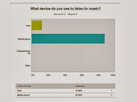
What device do you use to listen to music?
I asked these questions in particular, because I found which genre was most popular between the people I asked, I also done this to find out the general age I should make my magazine for. By doing this survey I have found out more about the demographic I need to choose, and the things they would like to see involved in a magazine. For the first question, 85.71% were female the other 14.29% was male. This made me choose to make my magazine for the female audience. For my second question, 12.50% were between the ages of 11-15 and the other 87.50% were between the ages of 16-20, adding this to the results from the question before, it was clear to me that I have to create a magazine for 16-20 year old females. The third question I asked was 'Would you pay £2.50 for a music magazine?' and 62.50% said they would buy a magazine for £2.50 but 37.50% said they wouldn't. I would still put my magazine price at £2.50, because most people I asked said they would buy a magazine for that price. The fourth question I asked was 'Do you enjoy reading magazines?', 87.50% said yes and 12.50% said no. My fifth question was 'Where would you buy a magazine from?', half of the people I asked said a supermarket and the other half said from a newsagents. The sixth question I asked was 'What would most appeal to you?' and the answers I got were 37.50% said posters, 12.50% said Covermounts, 50% said gossip and the last 12.50% said Interviews.
The seventh question I asked was 'Do you enjoy listening to music?', everyone I asked had said they do enjoy listening to music. The eighth question I asked would help me choose which genre of music I would base my magazine on, the question was 'Which genre of music do you mostly listen to?' the top two answers I got were Pop and Rock, the votes were equally split, 50% each. I am going to base my magazine on the pop genre, because its the genre I know most about and half the people I asked said they like the pop genre. The ninth question I asked was 'Have you ever attended a music event?' and everybody I asked said yes. The last question I asked was 'What device do you use to listen to music?', 12.50% said they used their iPod to listen to music and the other 87.50% said they used their mobile phones. This gave me an idea to add a feature to my magazines contents page like a small Twitter/ Facebook feed about different artists and maybe some tweets off them. This way bands/ artists can interact with their fans in another way.
Sunday, 6 October 2013
My own magazine front cover photoshop trial
I created my own version of a front cover including the masthead I am going to use when I come to producing my own music magazine, I decided to call my magazine Symphony because it is linked with music and it fits with my intended genre of music which is pop. I also chose Symphony, because the pop music magazines that already exist have a name like 'Top of the Pops' or 'We love Pop' which I find to be based at a younger audience even though their magazine may not be. The mastheads they choose might attract more of a younger audience. I have added an image of The Vamps, because they are slightly new to the music industry and are a pop/indie acoustic driven band who started out putting covers up on YouTube, so they would be able to relate to the people my magazine is aimed at. I have also placed a barcode in the bottom left hand corner of the cover just like you would find on already existing magazines. You would normally find the barcode for a magazine at the bottom of the magazine, however you do sometimes find the barcode under the issue number and issue date. The photo I chose to use was made up of bright colours, because all of the pop magazines I have researched use bright colours and that is what the main colour scheme is throughout each pop magazine I have looked at.
Subscribe to:
Posts (Atom)


+finished!!!!.jpg)


+finished!!!!.jpg)